Back Mediävalziffer German Minuskla cifero Esperanto Cifras elzevirianas Spanish Chiffres elzéviriens French Numeri maiuscoletti Italian Uithangende cijfers Dutch Cyfry nautyczne Polish Минускульные цифры Russian Gemen siffra Swedish Мінускульні цифри Ukrainian


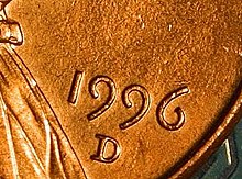
Text figures (also known as non-lining, lowercase, old style,[1] ranging, hanging, medieval, billing,[2] or antique[3] figures or numerals) are numerals designed with varying heights in a fashion that resembles a typical line of running text, hence the name. They are contrasted with lining figures (also called titling or modern figures), which are the same height as upper-case letters.[4][5] Georgia is an example of a popular typeface that employs text figures by default.
- ^ University of Chicago Press (2010). "Appendix B: Glossary". The Chicago Manual of Style (16th ed.). Chicago: University of Chicago Press. pp. 891, 899.
- ^ Birdsall 2004, p. xi
- ^ Birdsall 2004, p. 186
- ^ Bringhurst 1992, p. 36
- ^ Saller, Carol (March 14, 2012). "Old-Style Versus Lining Figures". Lingua Franca. The Chronicle of Higher Education.